Overview Dashboard
For Decision Makers:
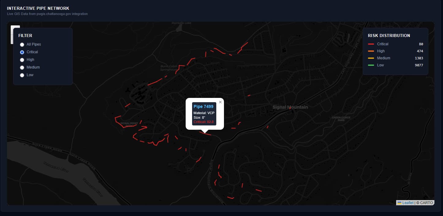
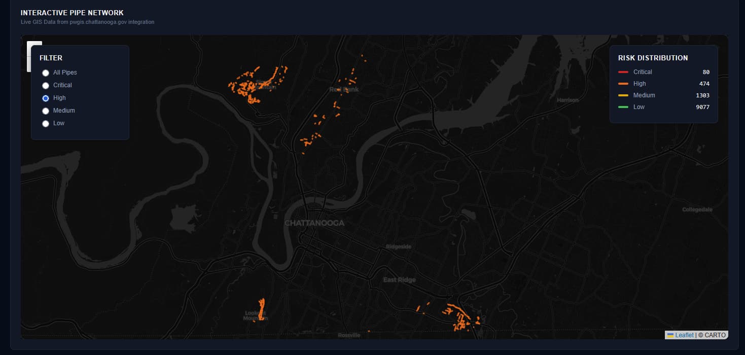
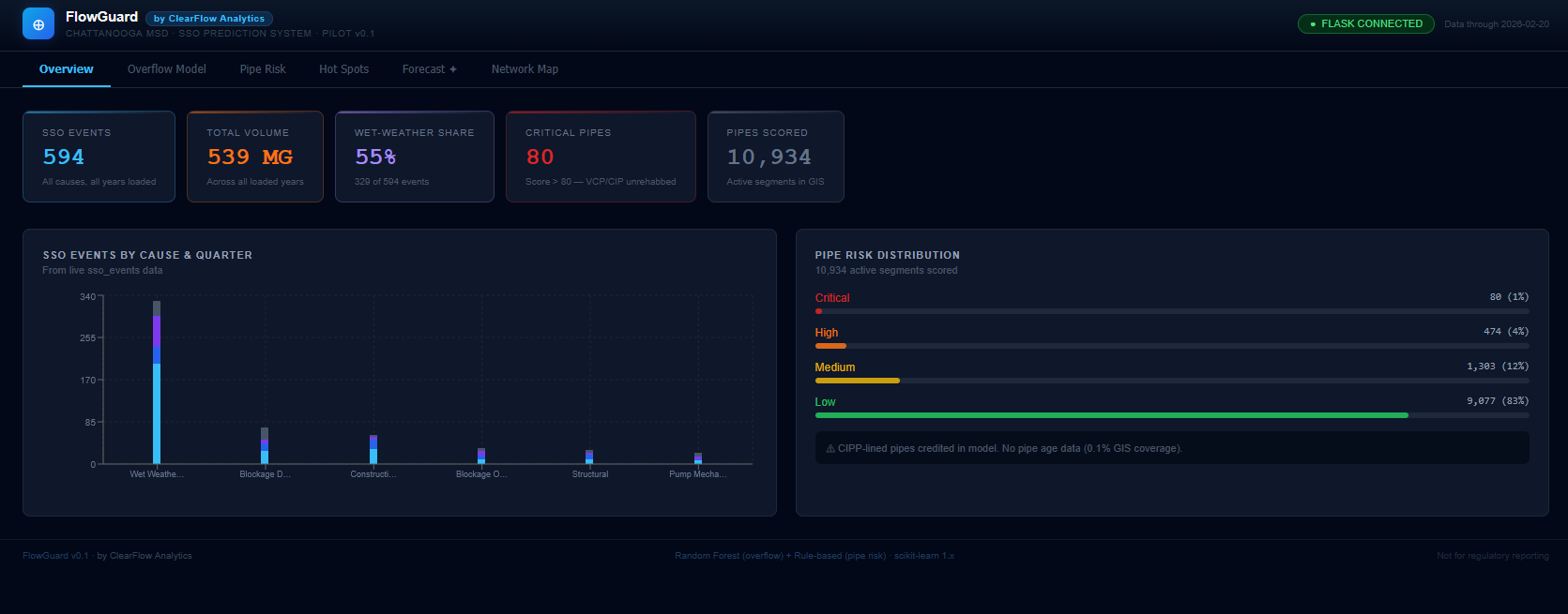
The Overview Dashboard provides executive visibility into system health and risk distribution. At a glance, see total event counts, critical pipe segments requiring attention, and historical patterns by cause.
For Technical Teams:
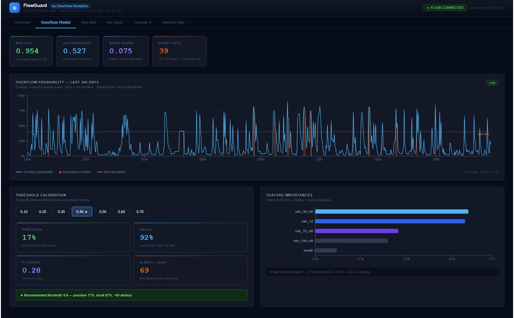
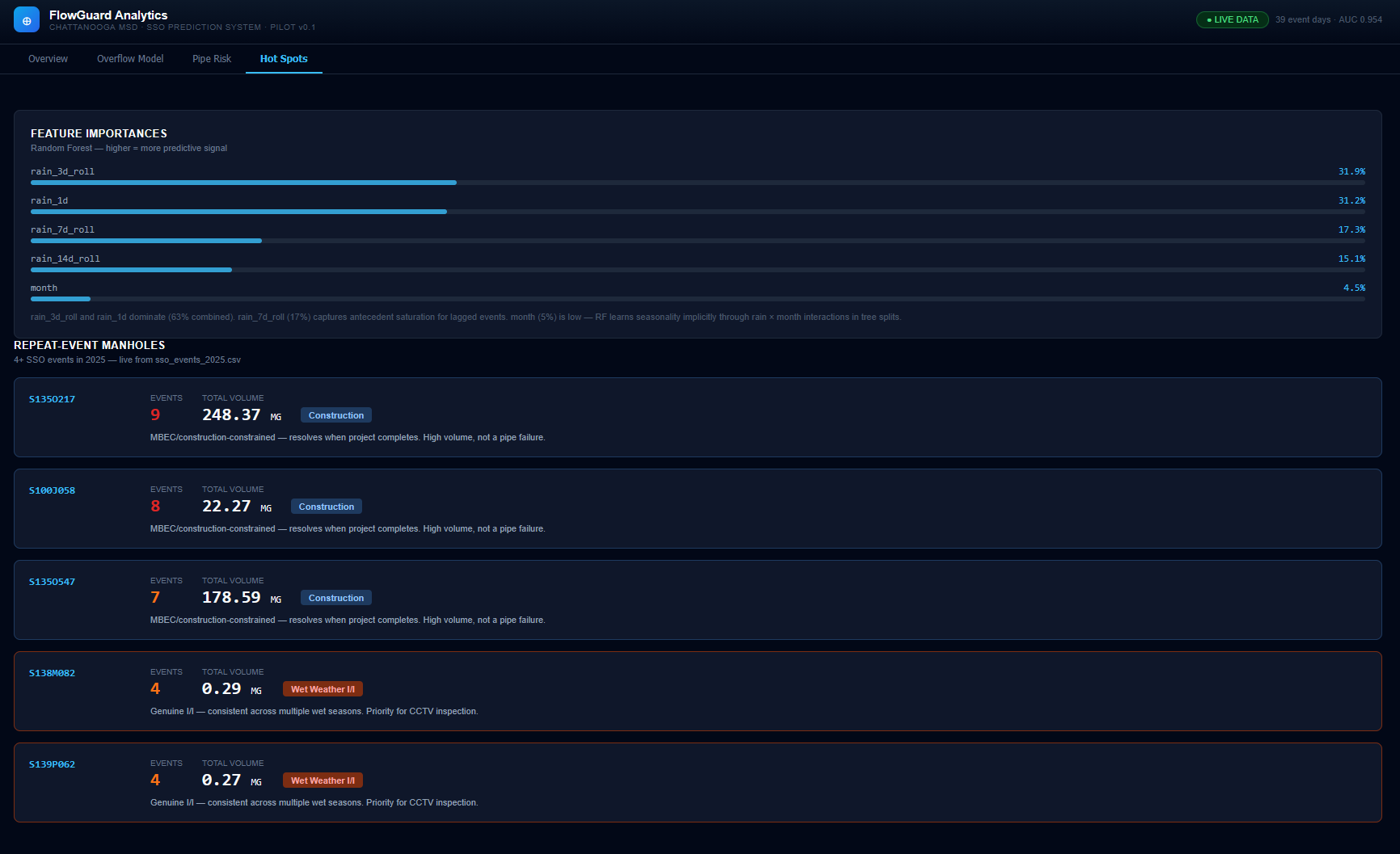
Integrates 39 event days of labeled data (2021-2025) with real-time weather and soil moisture monitoring. The model uses Random Forest classification on features including rainfall patterns (1d, 7d, 14d rolling windows), soil saturation, and infrastructure attributes. Performance metrics show 95.4% ROC-AUC with conservative threshold calibration for operational deployment.
Key Features:
- SSO event tracking by cause category (weather, construction, debris, mechanical)
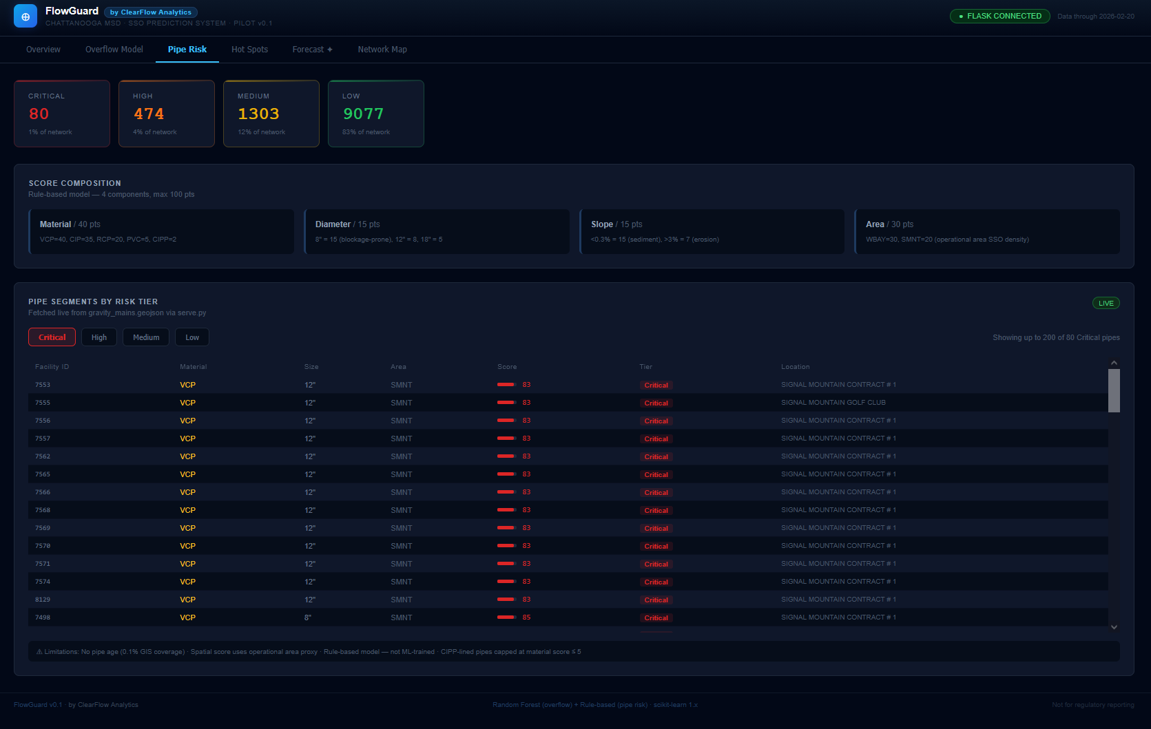
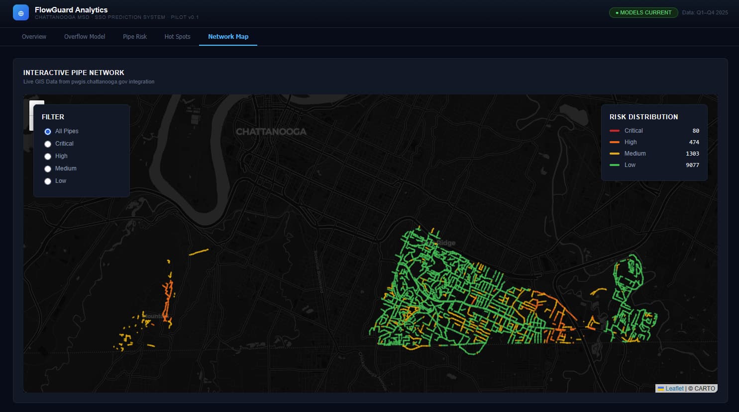
- Pipe risk distribution across 4 severity tiers (Critical >80, High 60-80, Medium 40-60, Low <40)
- Feature importance analysis highlighting precipitation and soil moisture as primary predictors